This is a mobile app design proposal based on the analysis of the current website.
Introduction
Elpha is an interactive community for women in tech to ask and receive professional or personal advice. The platform also provides access to companies who pay $12,000/year to get exposure in the community. It currently has over 17,000 active users and 23 paying tech company customers. With Elpha, aspiring and current women in tech now have increased access and visibility into the male-dominated professional field. They can now have an exclusive female support network to share experiences that relate to their identities. This networking opportunity, coupled with access to companies who post job positions on Elpha, increases their presence in junior and senior level engineering, product, and venture capital positions at these tech companies (i.e. more female representation in tech, theoretical narrowing of gender income gap).

Challenge
My team and I chose to create a mobile app for Elpha because it does not offer any other digital platform besides the website at the moment. This prevents instant feedback between users, as it requires them to use a laptop/desktop or a third-party mobile web browser. Our goal is to preserve the current website’s main functions—find communities, read posts, connect with other users, and search jobs—while taking advantage of mobile application’s notification and messaging system to encourage the interactive aspect of Elpha.
 Current website
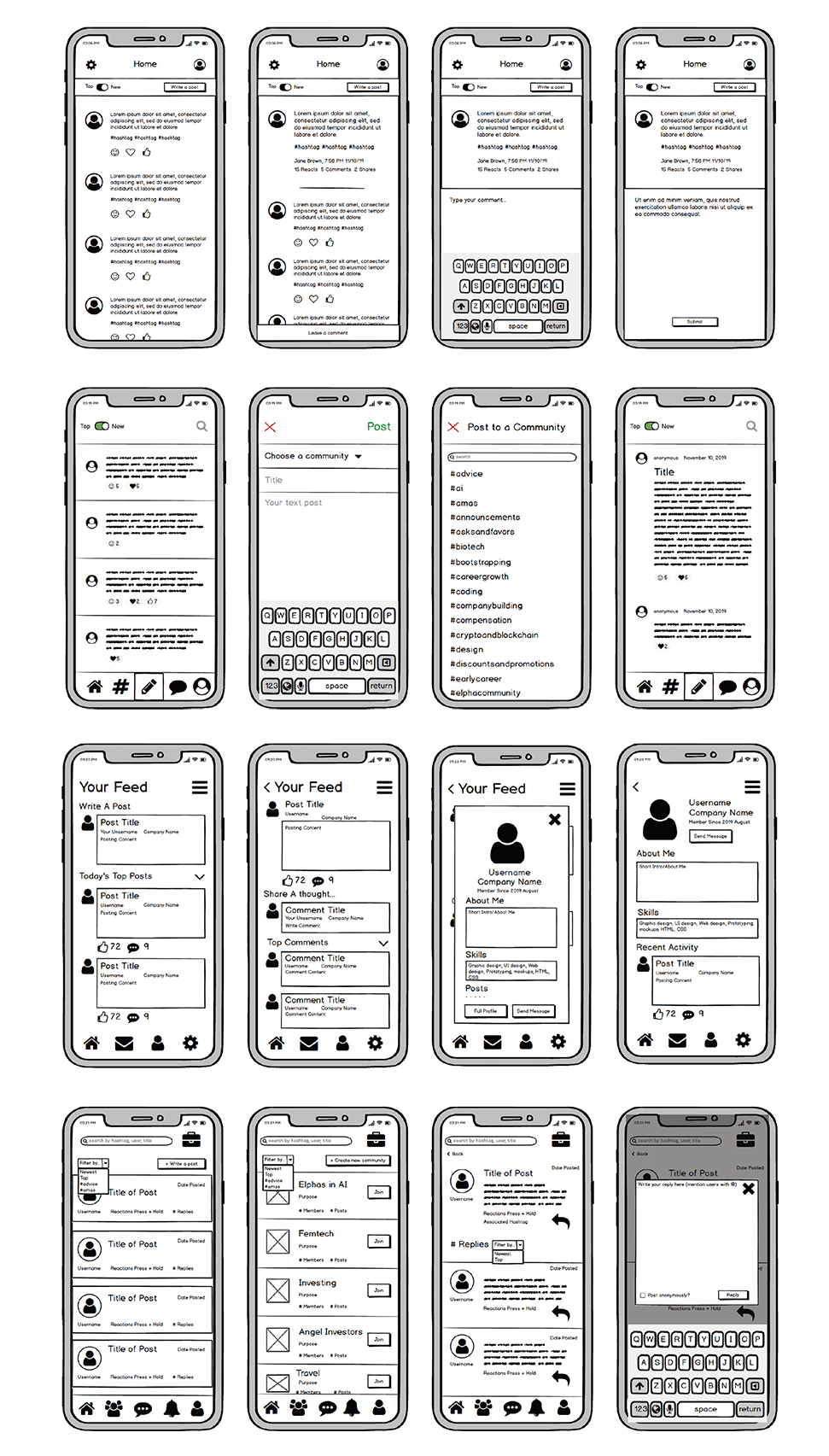
Preliminary Sketches
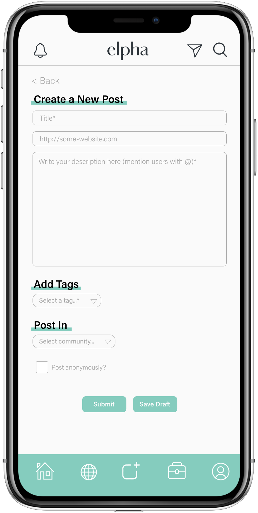
We implemented the bottom navigation bar to accommodate Elpha’s most important features—users can access Home, Community, Post Box, Jobs, and Profile, regardless of where they are on the app. We also decided to place the Direct Message and Notification buttons as these are the functions we want to highlight in the mobile version of Elpha. The icons on the top and bottom navigation bar are specified through titles of each page but do not have text labels, as they follow the same familiar mental model (similar imagery, i.e. house = homepage, person outline = profile, etc.) as other apps of similar layout such as Instagram and LinkedIn. Based on the critique session feedback, we have decided to reduce the amount of text on the screen by using a pop-up screen with an overlayed background. We also used dividers to establish more clarity between contents. These changes created the hierarchy in information and increased the overall readability.
User Testing
The user testing was done via UserTesting.com
Task
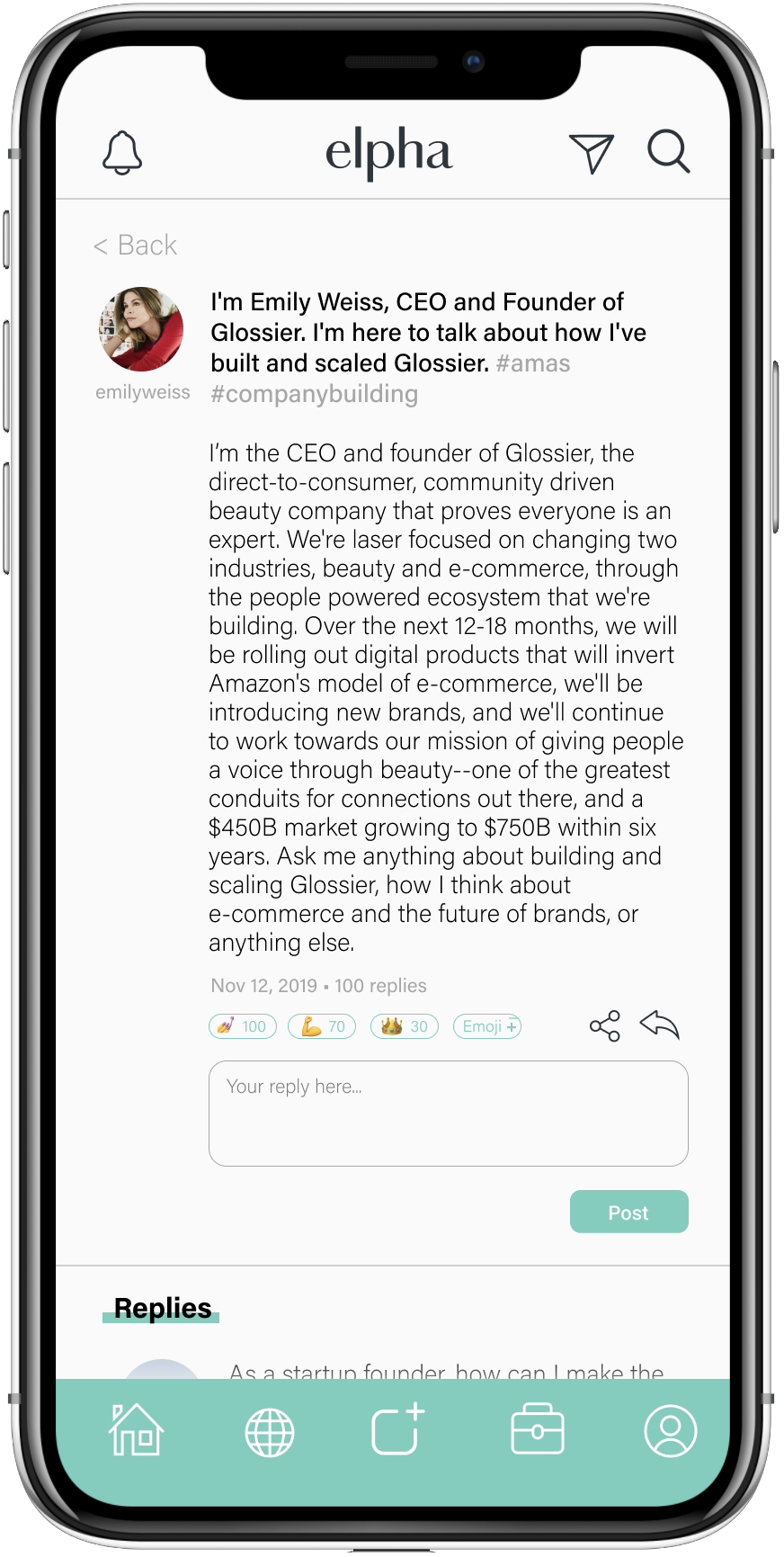
“Imagine you’re a new user to Elpha, an app made for women in tech, and interested in the makeup startup Glossier. Create an account to learn more about the CEO and founder of the company by reading her post and following her profile.”
Overarching Hypothesis
The user will intuitively use the fastest path to complete the task, which is to 1) click on Emily’s post on the homescreen that shows up upon login, 2) click on her profile picture icon, then 3) click the ‘follow’ button.
Other Hypotheses
Task completion time will be much faster once users have familiarized themselves with the platform.
Test Instructions
Step 1: Create an account and sign in.
Step 2: Find and read the post by Emily Weiss, the CEO and founder of Glossier.
Step 3: Take as much time as you need to explore this website. Move on to the next task when you’re ready.
Step 4: Follow the profile of Emily Weiss.
Post-Test Questions
1. On a scale of 1-5, how would you rate the ease of navigation.
2. What was the most frustrating part of interacting with the app? (ie. font size, flow, clarity, etc.
3. What are some similarities/differences between this app and other social media apps you use?

All three users were able to work through the tasks quickly and found the interface to be relatively intuitive. One user was confused about the sign-in process as we did not include screens to simulate a full account creation (e.g., allow actual typing), which accounts for the one incomplete task. Another user was also initially very confused about how to find Emily Weiss’s post and clicked through every page trying to find it. However, it was on the page they were initially on, so it was likely more of a communication/instructional problem. Perhaps this could also mean that the font size was too small, as we thought users would immediately notice and read the title of the first post, which would help them complete the second task. The font size was an issue for another user as well, who constantly zoomed in and out to read the words. This may be less of a concern, however, as the user testing was done on a computer rather than an actual phone, which would be held at a much closer distance than a laptop. It was also interesting to see that once task 3 was complete, which was to explore the interface, users were able to complete tasks much faster than before. With the exception of one user who made a lapse error, the users were able to quickly locate and follow Emily Weiss’s profile. This shows that our interface is memorable after initial exploration/uses, easy to learn, and aligns with users’ expectations.
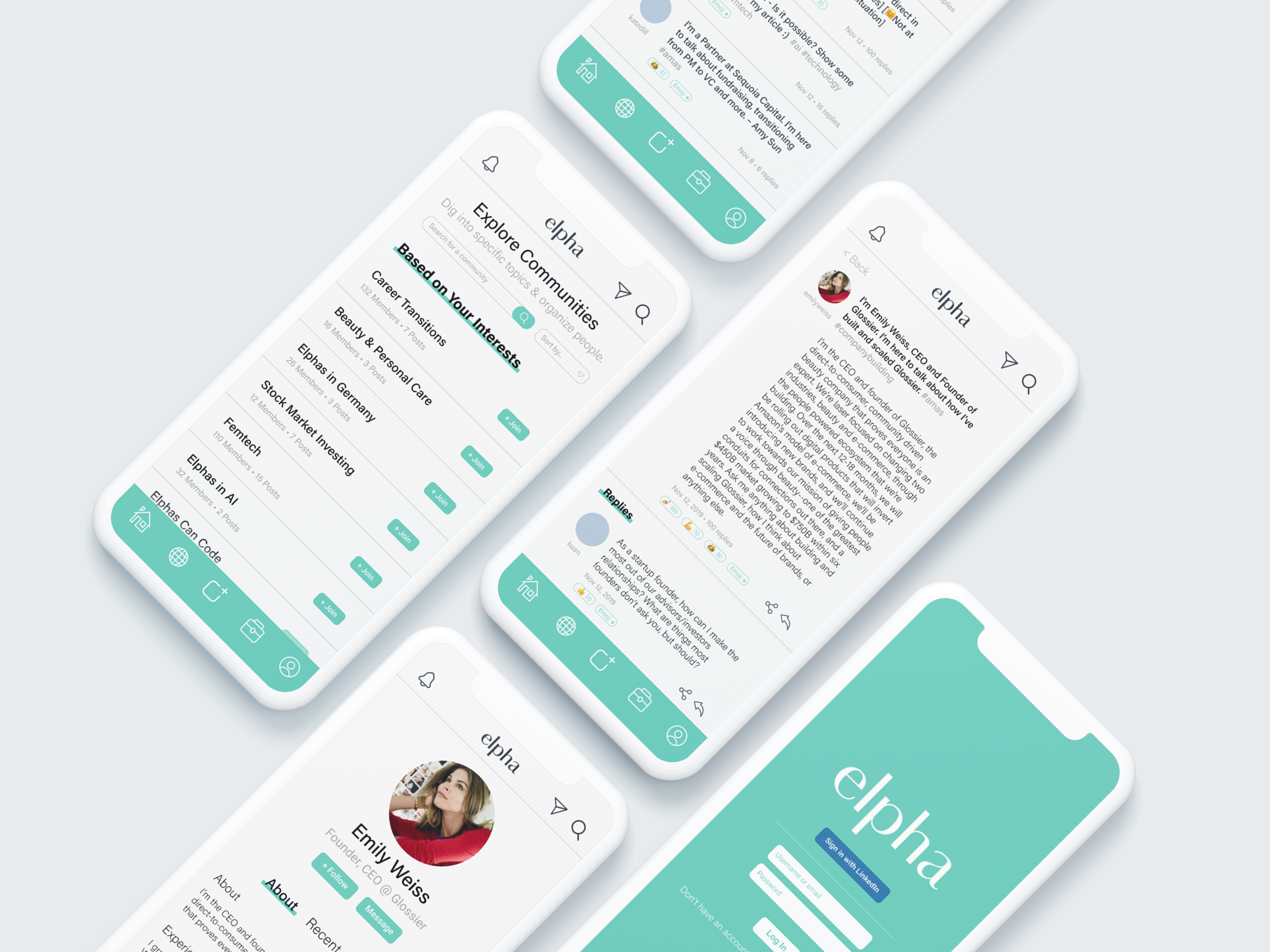
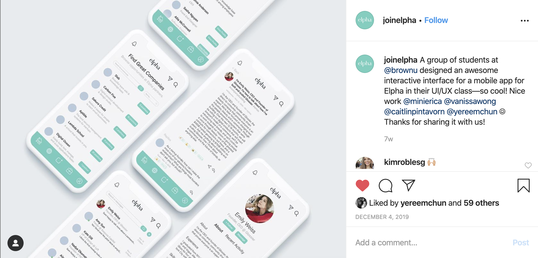 Our final design was featured on Elpha’s instagram account.
 Final Design
Click here to see the interactive prototype.
Based off of the UserTesting results and feedback, we would potentially look to make the navigation process even faster. For instance, we could include more options to exit or reverse an action without having to go to the bottom navigation bar to do so. This would be especially helpful for early users who may be confused about what certain functions do or are just looking to explore the app. We could also include more labels for the bottom bar functions to clarify the functions of each page – though we decided not to include this in our final design, it could be something of interest after some further A/B testing. Overall, the testing experience was really helpful in visualizing how users would actually interact with the platform and what they thought of particular design choices. This helped us understand how seemingly small design choices that seem intuitive to us designers could actually make a huge difference for users in other demographics (e.g., choosing between 11 or 12 pt font size). Across the board, the feedback was fairly positive, with everyone mentioning that the app was easy to navigate (average score of 4.67 / 5 on ease of navigation in post-interview), not very frustrating to use and that it echoed comforting similarities/the user-friendliness native on other popular apps like Twitter or Instagram.